Business Insights
Benefits of Setting Up Display Advertising
5 Reasons Why Email Marketing Is Here To Stay
Promote your website through offline marketing channels

Top 5 Ways To Promote Your Business Online
Zeald contribute to The Meeting Room regularly as guest bloggers.
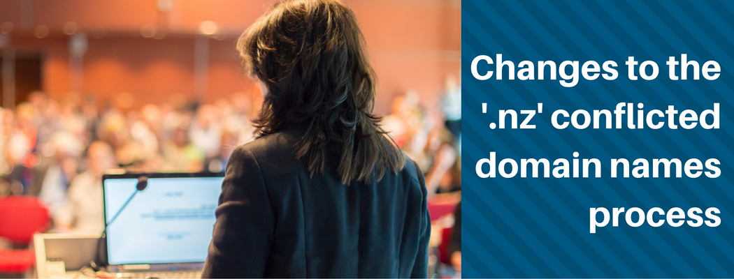
Changes To The '.nz' Conflicted Domain Name Process

Tips & Tricks For Running a Successful E-commerce Website
This blog was first posted in ‘The Meeting Room’, a blog dedicated to supporting small businesses.
Zeald contribute to The Meeting Room regularly as guest bloggers.
Zeald contribute to The Meeting Room regularly as guest bloggers.
Explore More Topics

Elevate Your Online Presence with Zeald, Your Premier Google Partner
Discover the power of partnership! This esteemed status places us in the top 3% of Google’s trusted collaborators globally, a testament to our expertise in digital marketing. ensuring your campaigns are not just managed, but optimised for exceptional performance.