Business Insights
Understanding Calls to Action

A call to action (CTA) is a phrase that is intended to motivate the reader to take action. On a website, a call to action would be something like ‘sign up’, ‘buy now’ or ‘click here’.
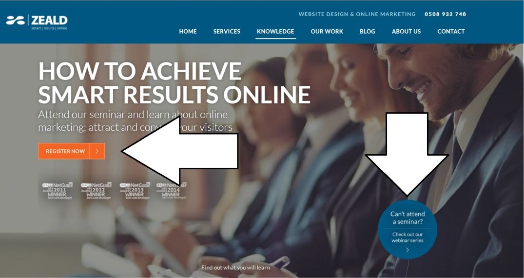
As you can see in the example above, an effective CTA will speak to the correct audience and urge them to click. Remember to keep the message short and use attention grabbing action verbs like ‘watch’, ‘discover’, ‘learn’, and ‘find’. You can also use words like ‘now’ to insert a sense of urgency, and encourage users to take action quickly. Another important thing to remember when deciding on the messaging, is to make sure it matches the page that the user will actually be led to. If you refer to your offering as a ‘white paper’ in your call to action, you don’t want it referred to as an ‘e-book’ on your landing page.
Once you’ve figured out exactly what you want your CTA to say, you’ll need to surround it with supporting messaging that communicates what is on offer. What makes clicking this so valuable? What is the user going to get out of it? Will they make money? Will they be happier? Again, be as brief as possible, while still getting an effective message across. This should be possible in one or two sentences max. You don’t want the user to be spending all their time reading this page, you want them to click the button to find out more!
Speaking of buttons, the CTA itself should be a big clickable button. You don’t want a little underlined piece of text, you want a massive button. It needs to be big and bright, and the most obvious thing to click on the page. You want users to be gravitating towards the CTA and hovering their cursor over the button before they’ve even decided to click on it. Just make sure it looks professional, and not like someone trying to steal credit card information.
Design is obviously a huge part of any CTA, so once you’re happy with your copy, it’s time to think about what sort of design will complement it best. Note that you don’t always want the CTA to match your website design. It’s often a good idea to have it contrast with your existing page design in order to stand out. Think about what colours and fonts ‘pop’ when superimposed over your website background.
So once you’ve followed these steps and chosen what you think is the perfect CTA, it’s time for the real work to begin.
What?
But we just made our CTA! It’s all done!
Not quite! Like all things web-related, your shiny new CTA needs to be tested. Oh, that bright orange button you thought was a great idea? Well it’s only getting 10 clicks a day, try a red one and see what happens. Every part of a CTA can be tested: font, colour, size, location etc. At Zeald for example, we use tools such as heat mapping for testing. This determines the placement of the CTA on a page. Creating a successful CTA is the exact same process as creating a successful website or digital marketing campaign. You need to test what happens when it's presented to a real audience, make changes, and learn from what works best. It’s all about testing, measuring and tuning your product so that you can get the best results possible.
If you need help with your calls to action, or digital marketing in general, don’t hesitate to...

Explore More Topics

Elevate Your Online Presence with Zeald, Your Premier Google Partner
Discover the power of partnership! This esteemed status places us in the top 3% of Google’s trusted collaborators globally, a testament to our expertise in digital marketing. ensuring your campaigns are not just managed, but optimised for exceptional performance.
