Business Insights
Banner Blindness
Wikipedia describes Banner blindness as a phenomenon in web usability where visitors on a website ignore banner-like information.
Usability tests and heat maps have shown that users may subconsciously block out and avoid viewing images that look like banner adverts.It is believed that this condition, known as "Banner Blindness" occurs when a user has seen so many websites with so many banner ads that they soon learn what a banner ad looks like and begin to subconsciously ignore or block out the images that resemble this common format.
The results of the studies contradict the popular web design belief that larger, colourful and animated elements on a website are more likely to be seen by users.
A recent eye track study by Jakob Nielsen proves "Fancy Formatting, Fancy Words = Looks Like a Promotion = Ignored"
.......or does it?
Such formats also rely heavily on graphics which increase the load times, make it difficult to update and are search engine unfriendly….yet so many high profile websites highlight important information in this manner. One of the highest performing ecommerce websites Victorias secrets uses Banner promotions to the extreme.
What if the "Banner Blindness theory was all myth? What if a fancy graphic promotion actually increased conversion rates?
The banner blindness theory certainly sounds plausible and eye tracking results support it....The only real way to find out for sure is to test it ourselves, time to find out for sure!
Hypothesis
Information presented on a website with fancy formating, that looks like a promotion or banner advertisement stands a higher chance of being ignored by the target user.The Experiment
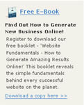
To test this theory we propose to split test a real live promotion on the Zeald homepage. One of the primary calls to action for the Zeald homepage is an offer to "Download a Free E-book"We have been running this offer for sometime now with reasonable results. The promotion appears at the top of the page in the right hand column above the fold.
The Original (the Control)
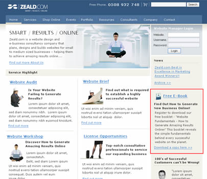
This original promotion has been design in a simple text format and follows usability guidelines. Beneath the headline a small amount of text introduces and describes the benefits of downloading the ebook, with a call to action at the bottom to "Download now"
The promotion fits the formating of the information around it.. It does not stand off the page, and it does not look like an advertisement.
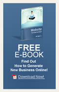
Combination 1
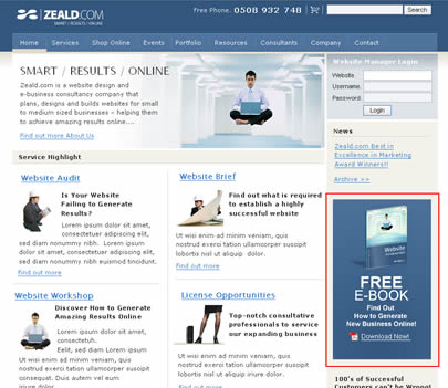
We would like to introduce a second promotion with the same call to action, and the same headline, the only difference; this one will be designed to stand out from the page, to look like an obvious promotion or banner Ad.
I do this by colouring the background, making the text headline large and bold and I introduce a large graphic of the ebook. In doing so I have to remove the introduction text so that the ad does not take up any extra space on the page.
The Results
| Combination | Conversion Rate (% change from original) |
 Original |
 Combination 1 - graphic |
109% increase compared to original |
The results show an overwhelming response to the graphic banner. Over double the visitors not only noticed the graphic banner, but they clicked on it. These results would suggest that in this scenario the banner blindness myth is busted.
Reviewing the initial experiment I wonder if the banner that I have designed is not obvious enough. Perhaps the blue colouring and the images I have used are too consistent with the Zeald brand and it does not appear detached enough from the website. A true Banner advertisement would appear very detached form the website look and feel. I would like to test this theory further by creating a third banner with colours and images that do not fit the Zeald brand; red for example, an obvious promotional advertisement colour.
Check back soon for part 2....
Explore More Topics

Elevate Your Online Presence with Zeald, Your Premier Google Partner
Discover the power of partnership! This esteemed status places us in the top 3% of Google’s trusted collaborators globally, a testament to our expertise in digital marketing. ensuring your campaigns are not just managed, but optimised for exceptional performance.