Business Insights
Don't Build a Mobile Website; Get One Site That Fits All
Over the last few years, more and more people and businesses are using mobile devices to browse the internet.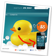 Nearly a third of New Zealand internet users access the internet via a Smartphone; and this trend will continue to grow in the future. This means that with more and more different types and sizes of devices coming online, your website pages will need to look different depending upon what is displaying them. Enter responsive design.
Responsive design is a way of designing web pages for mobile and desktop devices; in fact, the idea behind responsive design is that you design your web pages so that they respond to the device that is viewing it. Rather than forcing a mobile user to see a desktop site, a laptop user with a small screen to scroll horizontally to see a wide-screen monitor site, or a wide-screen monitor to view a site as a mobile customer might like, the design looks at each of these scenarios and adapts to display the content most effectively.
Why Responsive Design is a Good Idea
The best web designs are the ones that make things easy. Responsive web design makes your website user friendly for mobile customers. It is web design that responds to the user as they arrive at the web page.
Think about your typical desktop browser. Even if it is not maximised, it almost certainly has a width of at least 960 pixels. That is a lot of space to place lots of columns of text and images. If you compare that with a smartphone in portrait mode, you are looking at a device with about 480 pixels of width. That is half the screen space. A feature phone has even less space with 320 pixels or less in most cases.
If you create a page with a fixed-width layout 960 pixels wide, it will look great on your desktop monitor. But when you view it on a tablet, it’s going to look small. A smartphone will make it look even more cramped and on a feature phone, the page might not display correctly at all.
However, with responsive design you create a design that works for any of the devices visitors to your website use. What sets responsive design apart from other methods of mobile websites is that you don't create a separate webpage for every type of mobile browser you want to support. Instead, responsive design simply looks at the features of the device viewing the page, and delivers the styles appropriate for that device.
Creating a Whole Separate Website is a Bad Idea
It can be tempting to create a “mobile” site with a separate sub-domain or site location. Then you just put all the mobile friendly site features like single-columns, limited content, and reduced navigation in that one location and point mobile users there.
In the short term, this can work, as it gets up a mobile site quickly. But eventually it will start to cause problems. The first issue comes when you realise that you have to post every article twice; once to the main site and once to the mobile site! Why create that extra work for yourself?
Responsive Design Treats Mobile and Desktop the Same
A responsive web design uses the exact same content to create a page that works whether you are viewing it at 1800 pixels wide or 320 pixels wide. But the pages that are created may look vastly different, while containing the same content. This means that whether you come to the site on an iPhone or a 27-inch iMac, you will get the same content; in fact you will go to the same URL. But on the iPhone you might see the page with only one column while the iMac gets five. But they are both considered equally important when delivering the content.
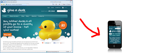
The website responds the the device and adjusts accordingly, while still retaining the important content.
Take a look at an example in action on a few different devices
Is Responsive Design Right for Your Business?
It depends what your customers are using to visit your site. You may find that it is not cost-effective enough if only a very small percentage of your customers are using mobile devices to view your website. You can use Google Analytics to track traffic to your regular website that comes from mobile devices like iPhones and Android devices. All traffic from mobile devices can be viewed by device or carrier under the 'Visitors' section in the 'Mobile' tab of your Analytics account, or in the 'Mobile advanced' section.
Responsive Design at Zeald
Zeald are now offering responsive design on all our websites.
Explore More Topics

Elevate Your Online Presence with Zeald, Your Premier Google Partner
Discover the power of partnership! This esteemed status places us in the top 3% of Google’s trusted collaborators globally, a testament to our expertise in digital marketing. ensuring your campaigns are not just managed, but optimised for exceptional performance.