Business Insights
Website Design & Screen Resolution
Feb 2010
Screen resolutions have changed very quickly over the last few years. These statistics from W3Schools suggest that today most users are browsing the web with a display of 1024x768 pixels or more resolution, with a color depth of at least 65K colors.W3Schools is a website for people with an interest for web technologies, so these statistics might not be realistic for the average user or for users in your industry. Most likely the average user will have display screens with a lower resolution.
But the statistics, clearly shows the long and medium-term trends in screen resolution.
.png)
Statistics source: www.w3schools.com
Smart mobile phone screen resolution
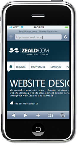 The above statistics do not show the use of mobile phone web browsing. Smart phones such as the Iphone and faster, cheaper mobile internet connections have made browsing the web on a mobile phone much more popular. We should be expecting a large increase in users browsing websites on their mobile phone in the next year. Most smart phones have an average display resolution of 480 x 320 pixels
You can see how your website might appear on an iphone using an Iphone emulator
So while desktop monitors grow larger in resolution, more and more users are turning to mobile devices with small displays designed to fit in a pocket.
This creates a website design challenge. When planning your website design you will need to consider which screen resolution you should optimise your design for.
If you think a large majority of your target customers might be browsing your website with a mobile phone, you should consider optimising your website for these users. There are a number of ways that you can do this:
- Create and maintain a separate website specifically designed for mobile phone users optmised for a screen resolution of 480 x 320 Cons: expensive to setup and maintain
- Design your website specifically for mobile phones, optimised for a screen resolution of 480 x 320, which will also work on a desktop monitor. Not the best use of screen realestate for wide monitors
- Design your website as a fluid width single column design so the content fits any screen resolution. Cons: You will need to make images small and you will have little control over the design. Also makes reading difficult on larger monitors with a large number of words per line.
For example smart phones like the Iphone make it easy for the user to zoom in and out and scroll up and down, left and right. This makes it reasonable easy to browse a website that has been designed for a higher screen resolution.
Other technology that mobile hardware companies are experimenting with to make mobile screens larger include, flexible screens that unfold or roll out, double displays that slide or fold out, projector displays that project onto a flat surface.
Original article: Published 2007
Screen Resolution
More and more computers are using a screen size of 1024x768 pixels or more though many users still have only 800x600 display screens.1024x768 Vs 800x 600
Zeald recommend that websites are designed to fit an 800 x 600 pixel browser for a number of reasons:
- A significant number - 7 - 10% is still a significant number of customers to make it extremely difficult to browse the website, effectively making it un-usable for them. Consider the real world analogy of a shop, would you close the door to 8 potential customers out of 100 because their technology was not up-to-date? One should also keep in mind, that while the use of 800 pixel res monitors are subsiding....smaller held held devices are on the increase and these work best with a smaller screen res.
- A web Standard - fixed width 800 pixel wide website designs are the most common format on the web. They are a web standard. IE if you browse the web, you will find 9 out of 10 websites are designed for this resolution....possibly more. This means that when you are browsing the web, most people are familiar with this dimension websites, they are setup for this dimension. When they stumble upon the wider format, it may be somewhat disconcerting, things are not in the same place, it may appear confusing, and difficult to use. A good example I like to use is the Adobe website. A website designed for graphic designers and website designers, who you would expect would all be using the very latest widest fanciest monitors in the world. - designed to fit an 800 pixel wide monitor?
- Reduced browser areas for user preferences - Because people are most familiar with navigating the 800 dimension websites, while they may use a larger resolution monitor, they may have their website browsers reduced in size to fit two or three websites side by side, or layered so they can see pages loading behind, or next to the application that they are currently working on. They may also have navigation bars set to display down the left hand column of their browser, such as bookmarks or history. The "Screen resolution stats" are not able to determine these user preferences, so no one knows just how many people do this. I know a number of people at Zeald do it.
- When websites are designed to fit this width, the content area is increased and so the text flows across with many more words per line than is recommended for optimum readability. 7 - 10 words per line. Often this will be increased to 20 - 30 with a 1024 pixel width design....even with 3 columns.
The 100% width setting
is an alternate option however we do not recommend this for the following reasons:
- banner graphics cannot be designed to fit the full width because the width is variable and image dimensions are 'hard coded'
- Text set to display 100% on a 'wide screen' exceeds the 7-10 word readability limit. Usability studies show that blocks of text become difficult to read when displayed in long horizontal strings that exceed 7-10 words.
Color Depth
Most computers use 24 or 32 bits hardware to display 16,777,216 different colors:Older computers and laptops often use 16 bits display hardware. This gives a maximum of 65,536 different colors.
Handheld computers and very old computers often use 8 bits color hardware. This gives a maximum of 256 colors.
Web Safe Colors
A few years ago, when most computers supported only 256 different colors, a list of 216 Web Safe Colors was suggested as a Web standard.This 216 cross platform web safe color palette was originally created to ensure that all computers in particular macintosh and PC computers, would display all colors correctly when running a 256 color palette.
Unless your website is targeting hand helds or very old computers it is probably not important to design for a 256 display, since more and more computers are equipped with the ability to display millions of different colors.
Explore More Topics

Elevate Your Online Presence with Zeald, Your Premier Google Partner
Discover the power of partnership! This esteemed status places us in the top 3% of Google’s trusted collaborators globally, a testament to our expertise in digital marketing. ensuring your campaigns are not just managed, but optimised for exceptional performance.